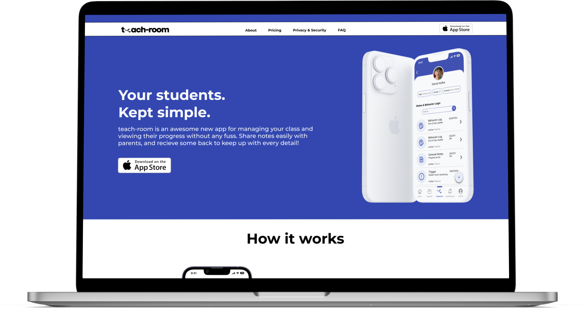
Supporting Educators: teach-room
Children with special needs and disabilities are not receiving the support they need in regards to education. My app teach-room was designed to support the educators who are vital in this process and increase communication between them and parents.
Project Overview
TIMELINE:
3 Months
PROJECT TYPE:
Capstone
ROLE:
UI & UX Designer
DESIGNED FOR:
Mobile
TOOLS USED:
Figma, FigJam, InVision
For this project we were given around 3 months to create an application to solve any issue of our choosing. For my capstone I decided to create an application that can support Special Education Assistants (EAs) in giving better education for students with special needs. After interviews with many different educators, I came up with teach-room.
TABLE OF CONTENTS:
- Research
- Ideation
- Wireframing
- Brand Development
- Final Prototype & Key Learnings
Research
Many youth and parents feel they do not receive adequate support - here are the numbers:
Research Objective
The objective of this research is to obtain insight into the painpoints of educational assistants (EAs), specifically looking more into current tools and support systems the EAs use. The desired outcome is to greatly reduce the stress of EAs while helping them in assisting youth with disabilities in a more effective manner. Based on this I came up with the following hypothesis:
"I believe that there is not a way for EAs to organize all the information on their students in one place efficiently, causing more confusion on students progress and lack of transparency with parents. I will know I am right when at 66% of interviewees confirm that there are no good tools that assist in organizing information, and lack of communication from parents."
Interviews/Primary Research
To gather further information I interviewed three people with the following criteria:
Experience working with kids who have special needs
Live in British Columbia, Canada
Between the ages of 25-60
During these interviews I mainly asked about different facets of working as an educator, and what pain points they face during the job. In order to make sure the solution would be user centered it would be essential to create a persona. This persona was based on the initial secondary research + the insights gained from the interviews. Based on the persona I created a 'How Might We' question that could help focus the solution even more:
How might we empower Special Education Assistants (SEAs/EAs) to feel confident in supporting students with special needs in order to reduce the amount of burnout and stress that EAs go through?
To get a better idea of what the educators struggled with the most I created a current state experience map. This showed the typical experience of the educator as they go throughout the day and how they feel during different points in the day. This helped pinpoint different places where I could intervene with a design.
Ideation
I decided to focus on the theme "Access to Student Information" as the theme showed up over and over again in the initial interviews with educators and as potential opportunities for intervention. To get a better idea of what the possible solution would look like I authored some potential user stories that would show the needs/wants of the users.
"Sometimes I wish there was a better way to organize the information we receive about students."
"Biggest frustrations is organizing these files and it takes up a lot of my time”
"I don't have tools to organize it. Need to by hand etc. into the Google drive or binders which takes a long time."
As an EA (Education Assistant) I want:
- easy access to behavioral logs so that I can access it throughout the day while educating the children
- a way to organize the logs in one place so that I can access what I need in a timely manner
- to highlight interventions that worked so that I can use them later on
- an organized space to identify triggers for children so that I can avoid or work on those triggers
As a parent of a student I want:
easy access to my childs notes and information so that I can see their progress
a way to communicate new behaviors/information with my educators so that they could plan accordingly
one place that has all my childs notes so that I can easily share them with any professional that needs them
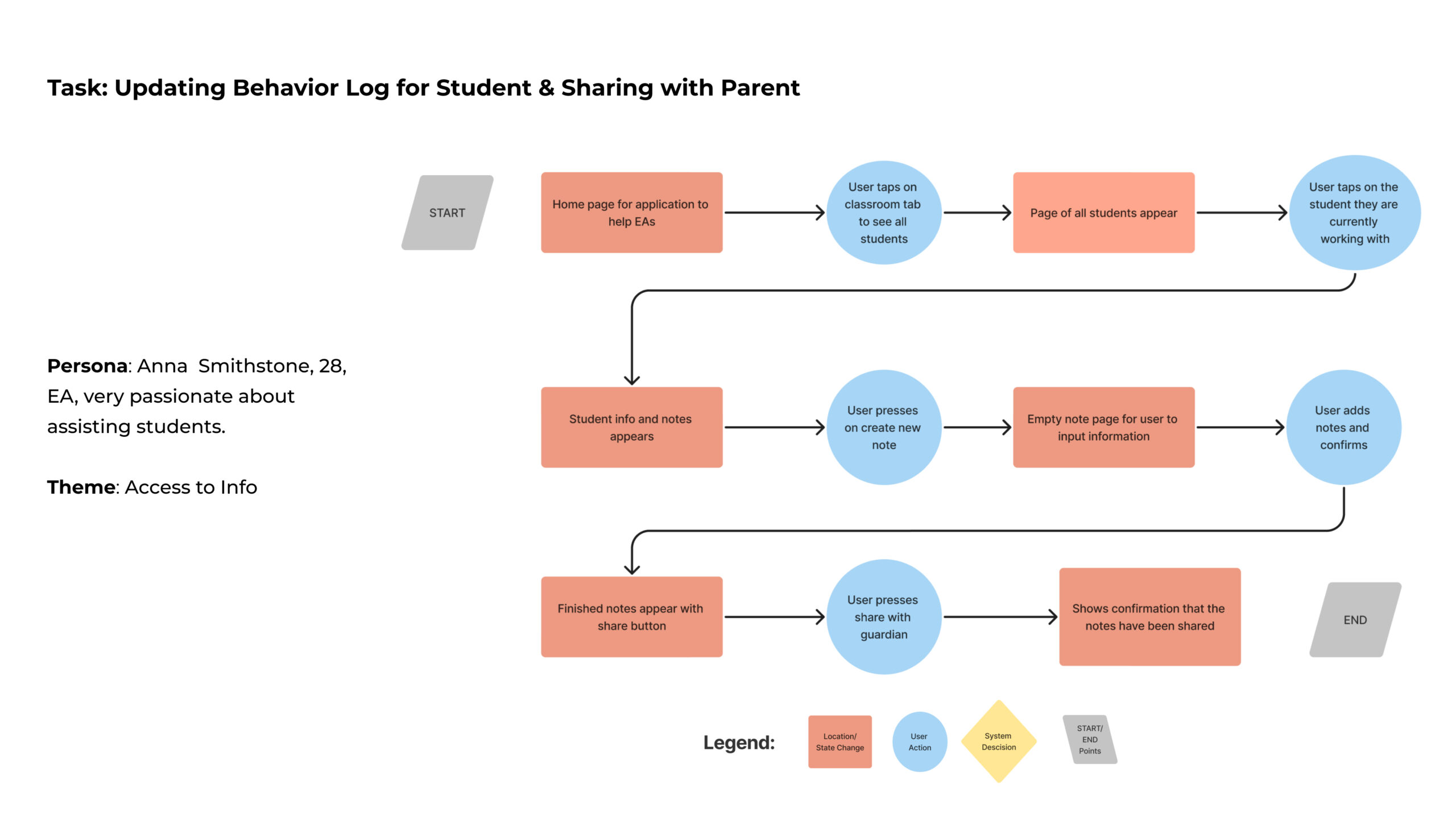
Since there were two potential users, I chose to focus more on the EA side since there was a time limit on this project. To help with moving forward in the ideation process I created a task flow diagram of what a potential solution would look like.
Sketching
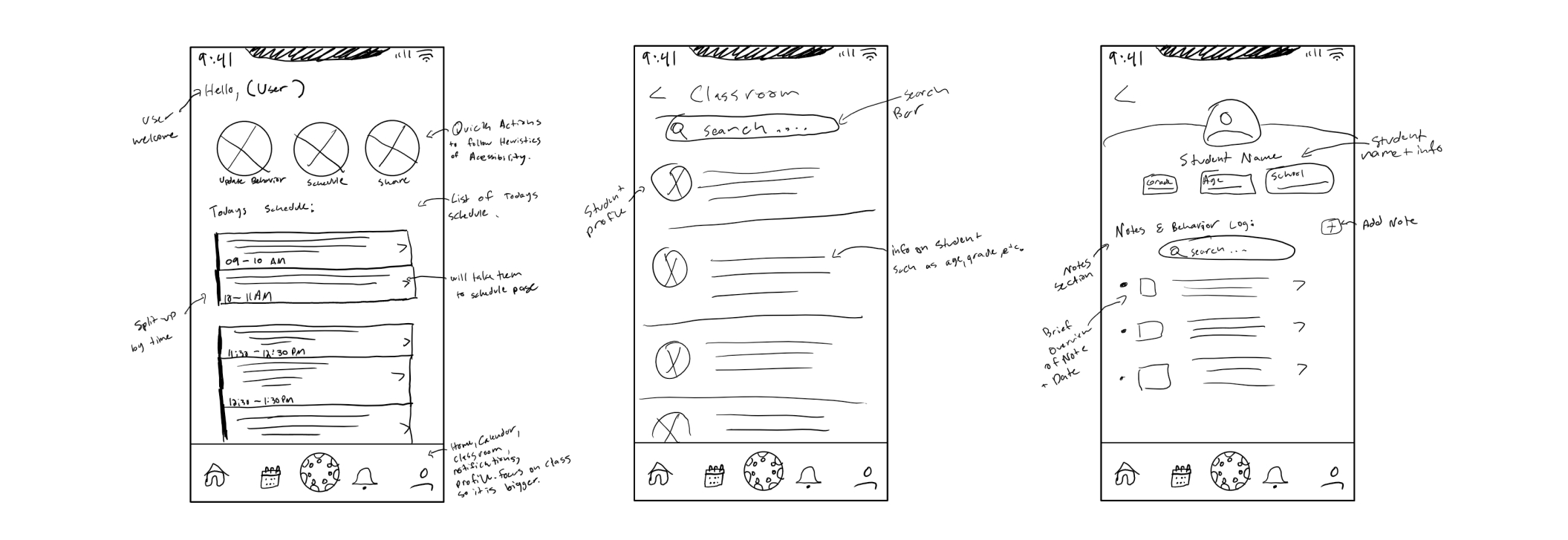
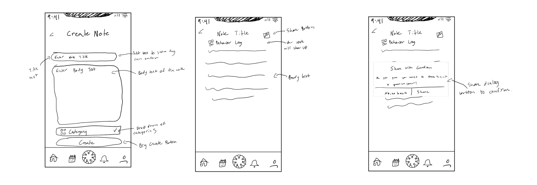
I then moved to sketching potential solutions to the issue. This took place in two different stages: exploratory sketches, and solution sketches. With the sketches done I could move into prototyping.
Exploratory Sketches


Solution Sketches
Wireframing
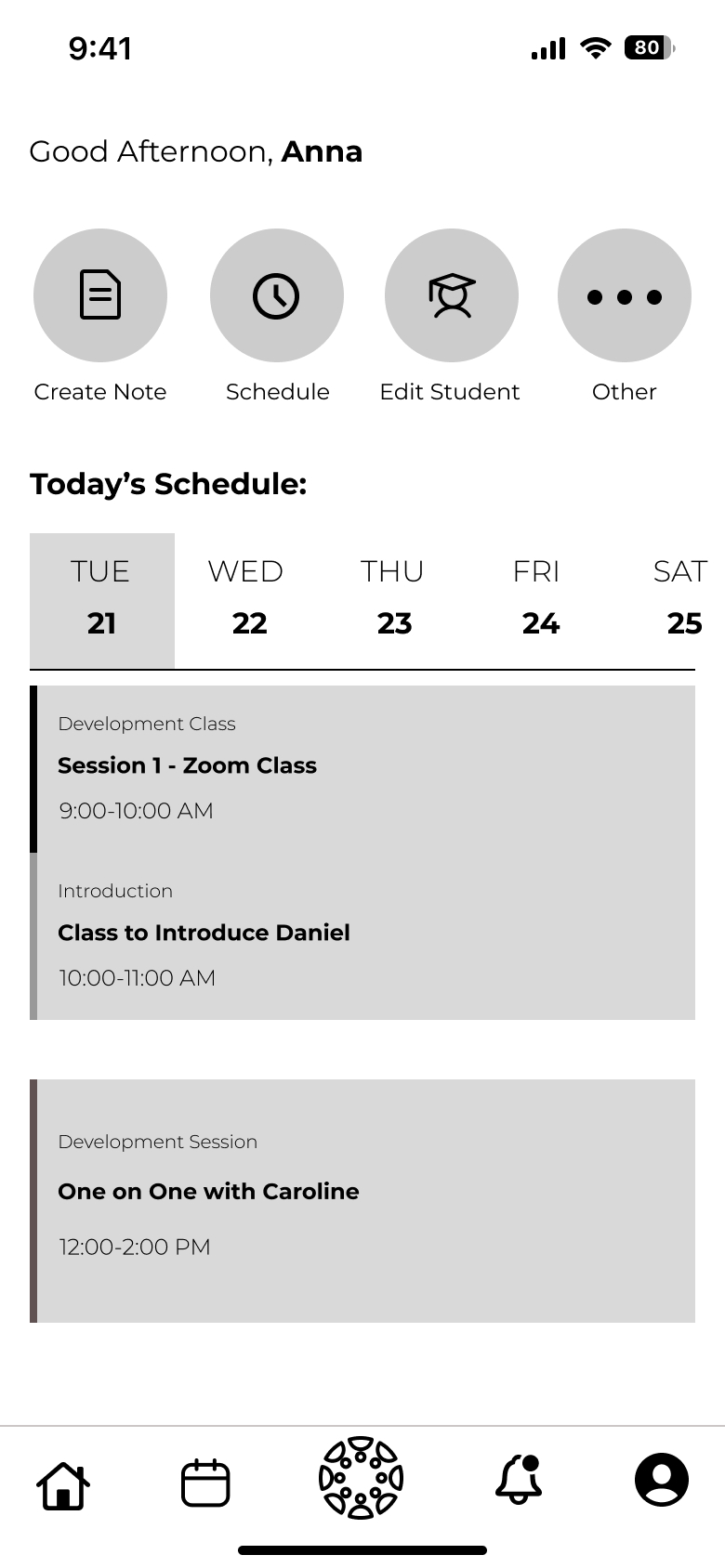
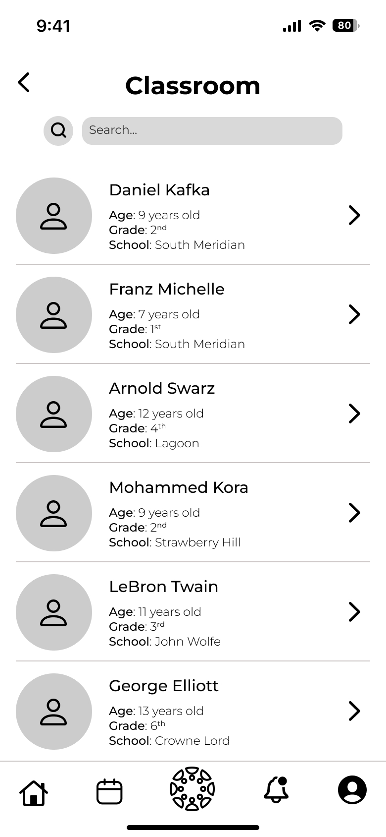
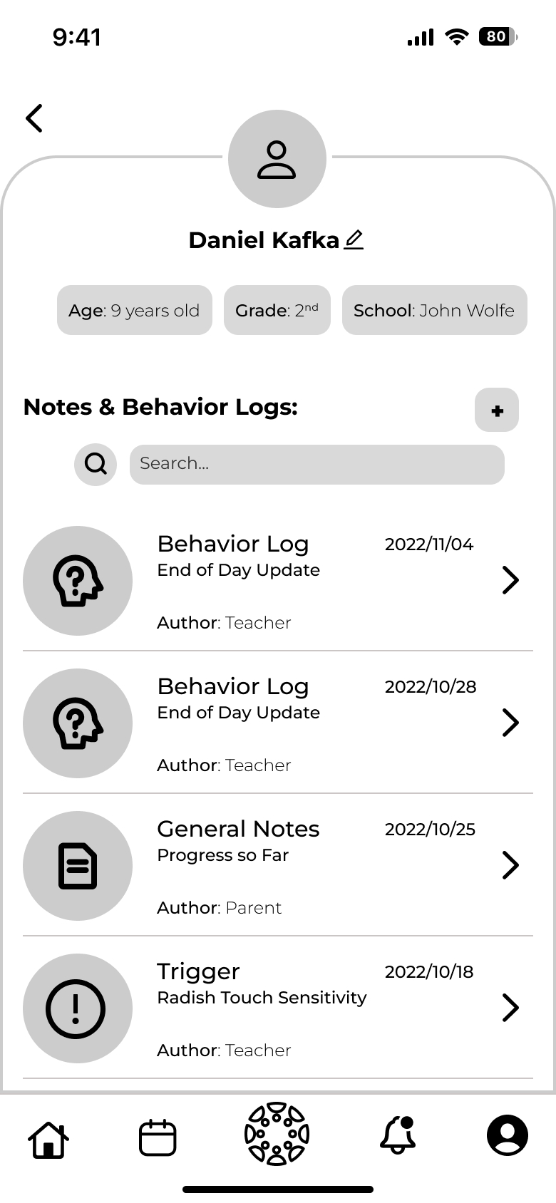
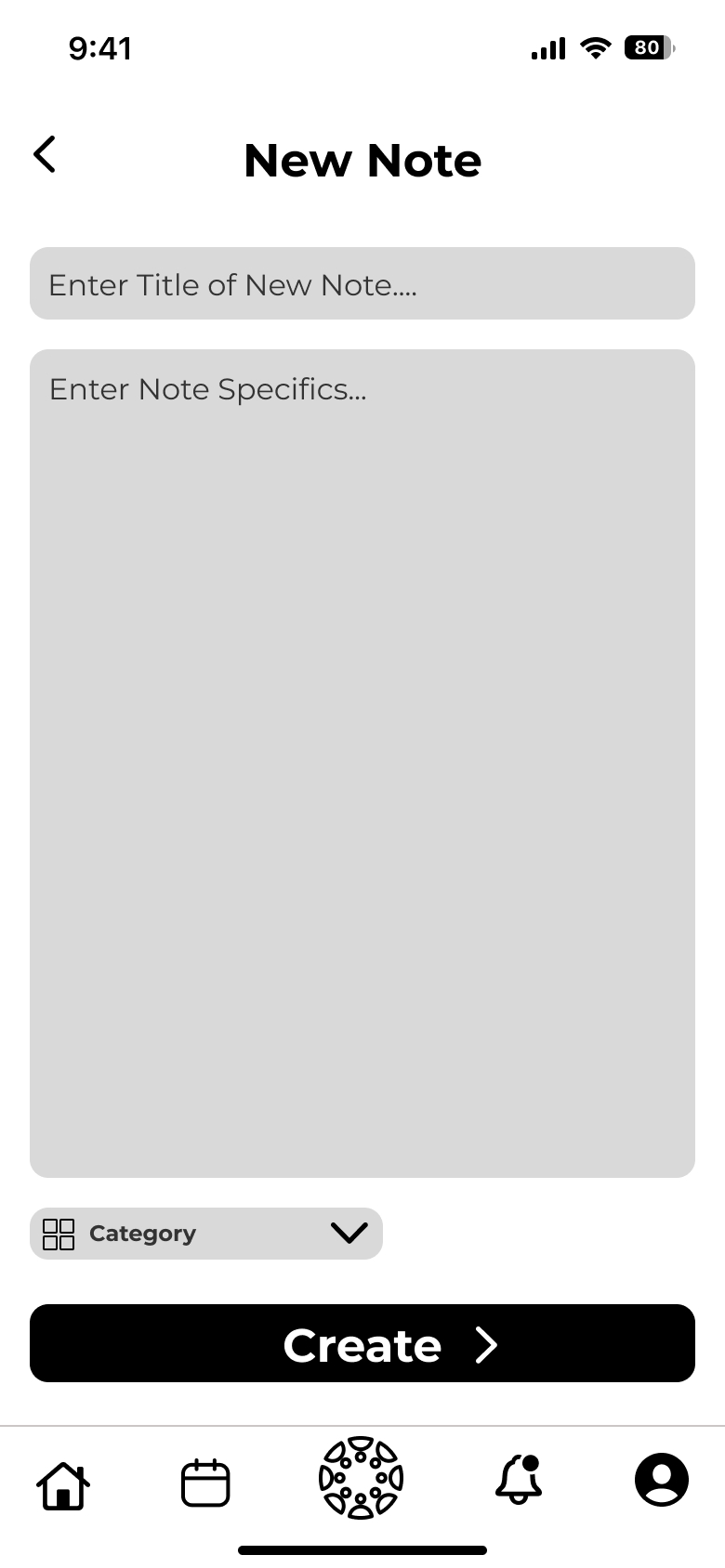
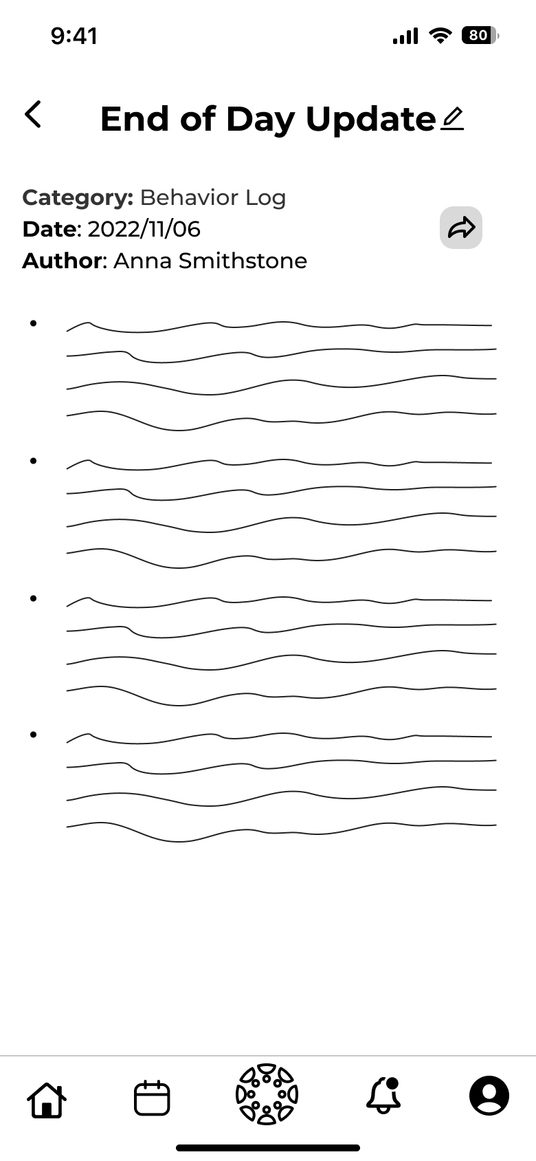
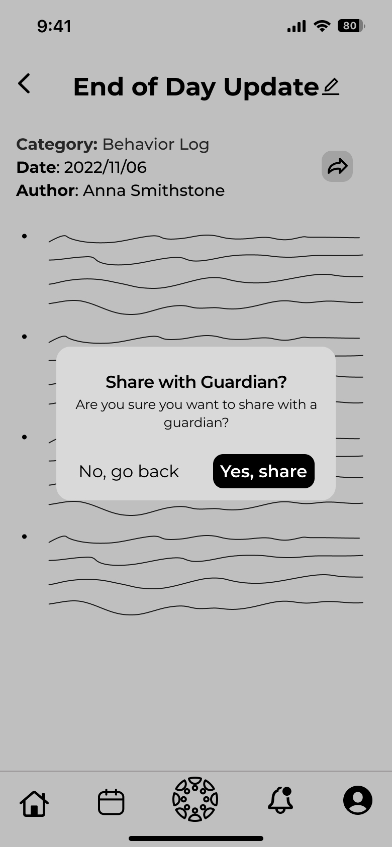
User Testing
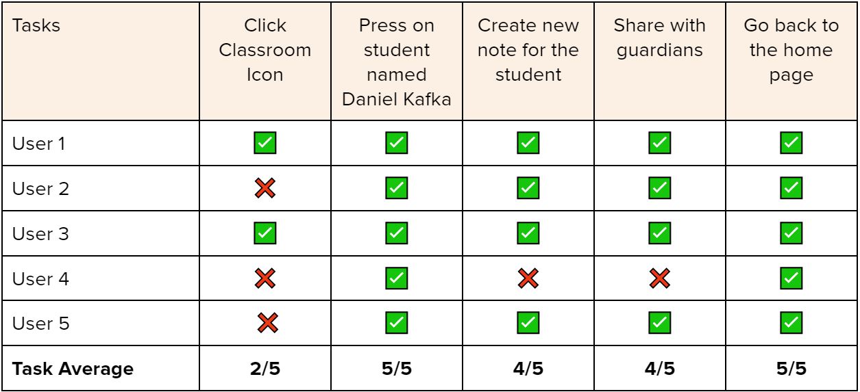
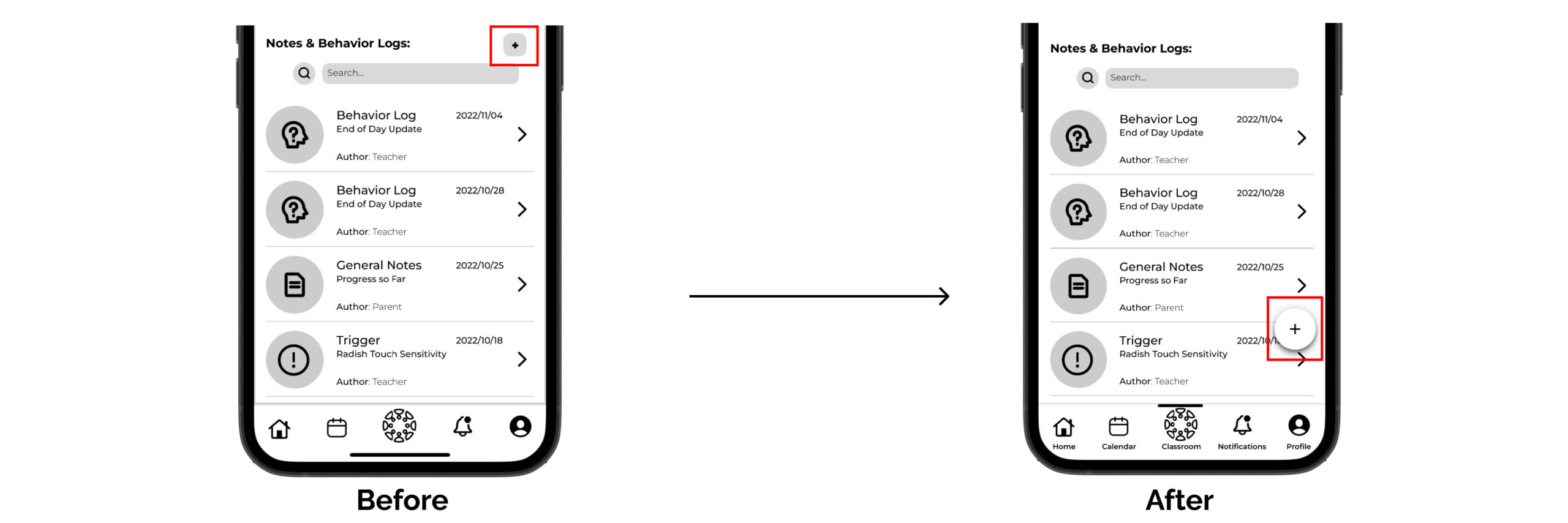
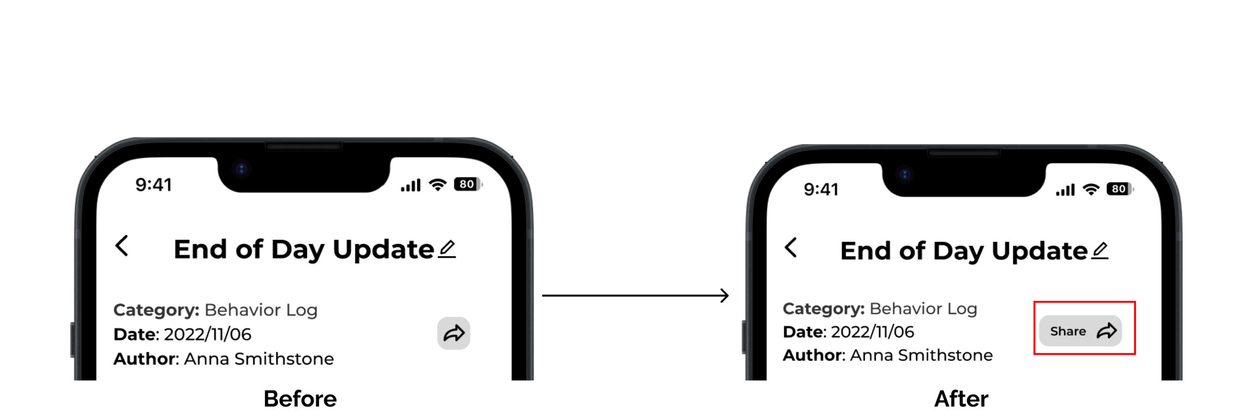
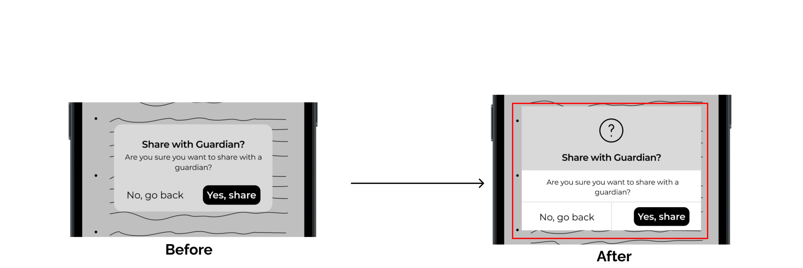
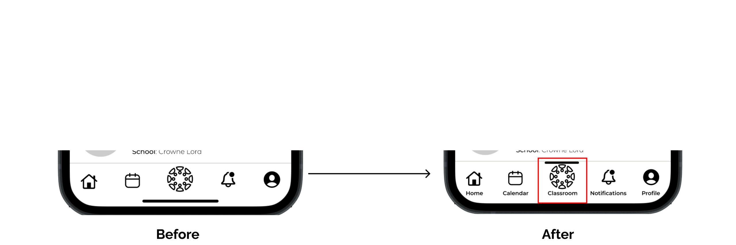
Once I had created the initial prototype it was vital to test the app for functionality. To do this I asked participants to complete five different tasks within the prototype. I then created a table to see the tasks that performed poorly over all participants. I then made improvements to the application, and repeated the process once more to have make sure the main functions of the app were easily understood. Once I had my final mid-fi prototype I moved on to creating some of the branding for my app.
Brand Development
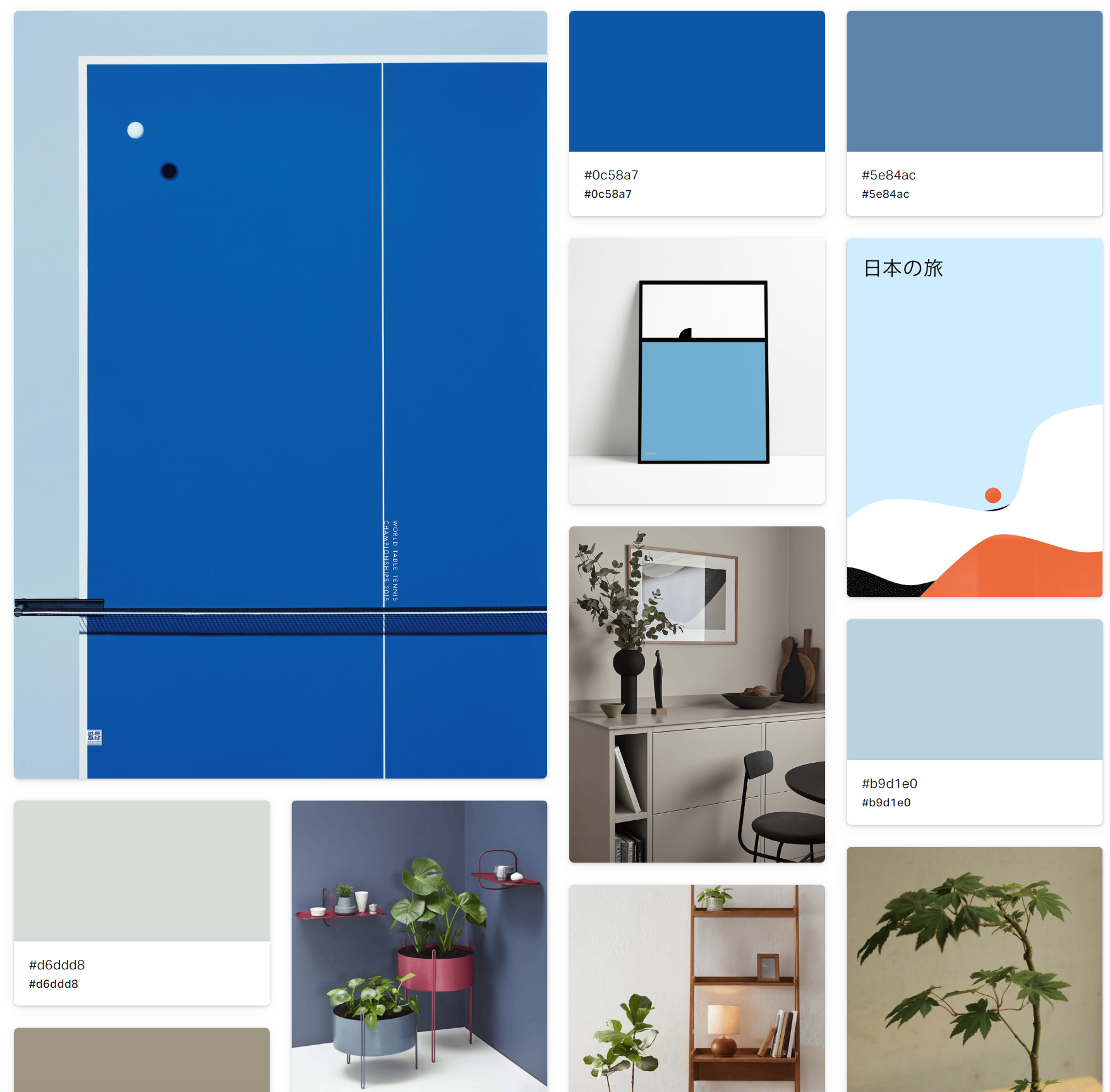
Once the main functionality of the application was done it was important to develop a brand identity, and start injecting colors. However, before that could happen I came up with a list of adjectives to describe the brand, and a mood board that captured the identity I wanted to display:
Main Theme: Focused & Minimalist
Easy | Important | Interactive | Motivating | Hands-On | Effortless | Simple
Wordmark & App Icon
I had to then decide on a brand name, and thought of three intially:
1. EduDocere: Docere is Latin for teaching, mixing with the English word education, a little clever
2. TeachRoom: Very simple, and rolls of the tongue. A mix of teacher and classroom.
3. IuvoTeach: Iuvo means help in Latin, which is what most teachers do.
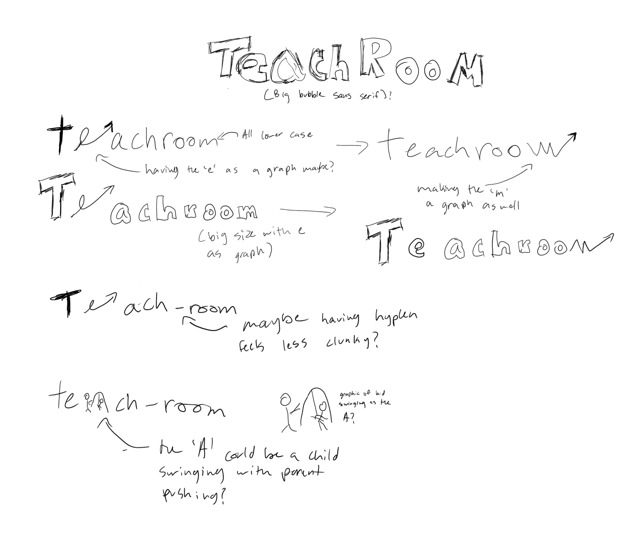
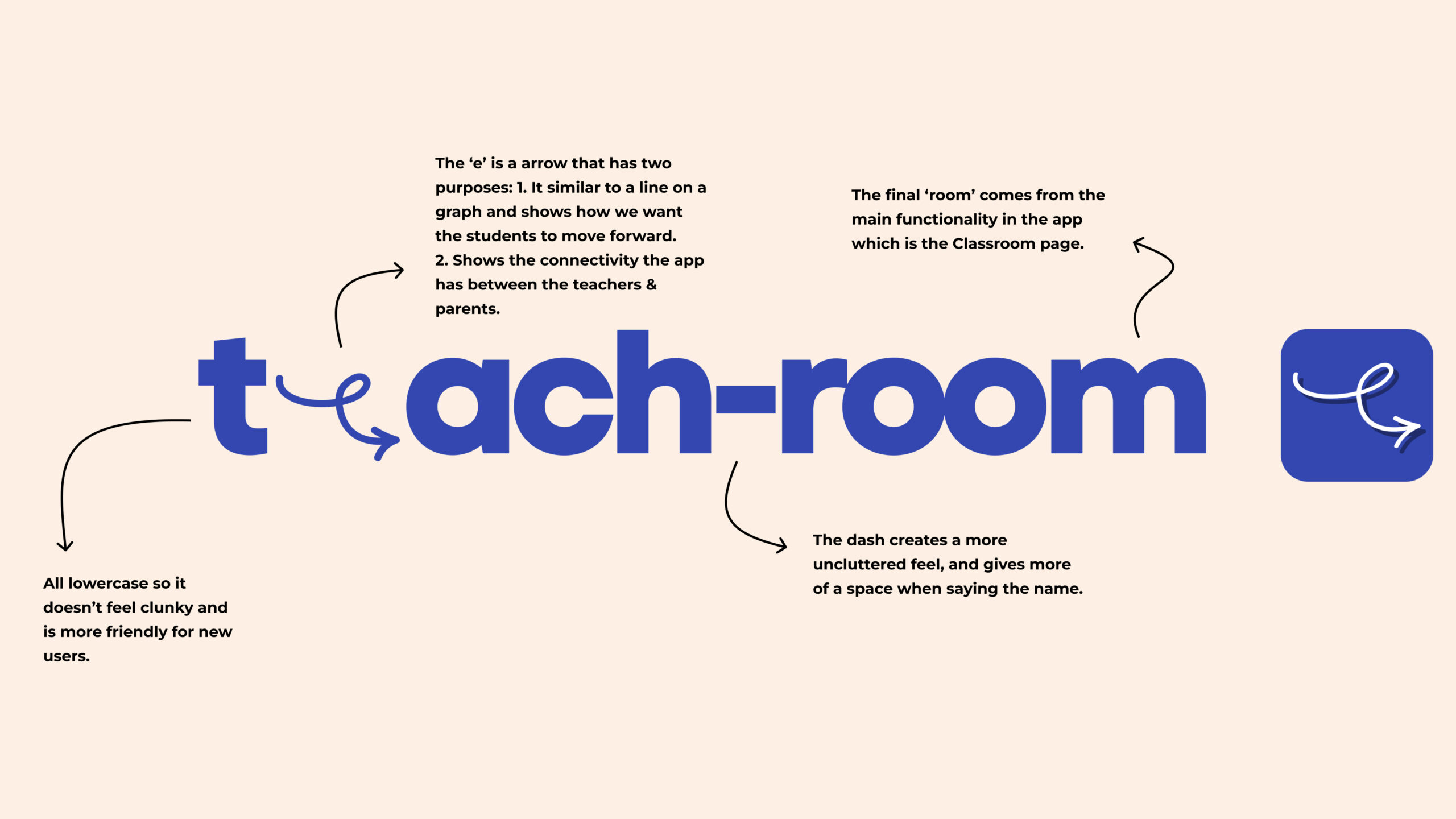
After discussing with many different people, I settled on TeachRoom as it was simple, and matched the adjectives I had set up. I started sketching some possible ideas for how the word mark would look like.
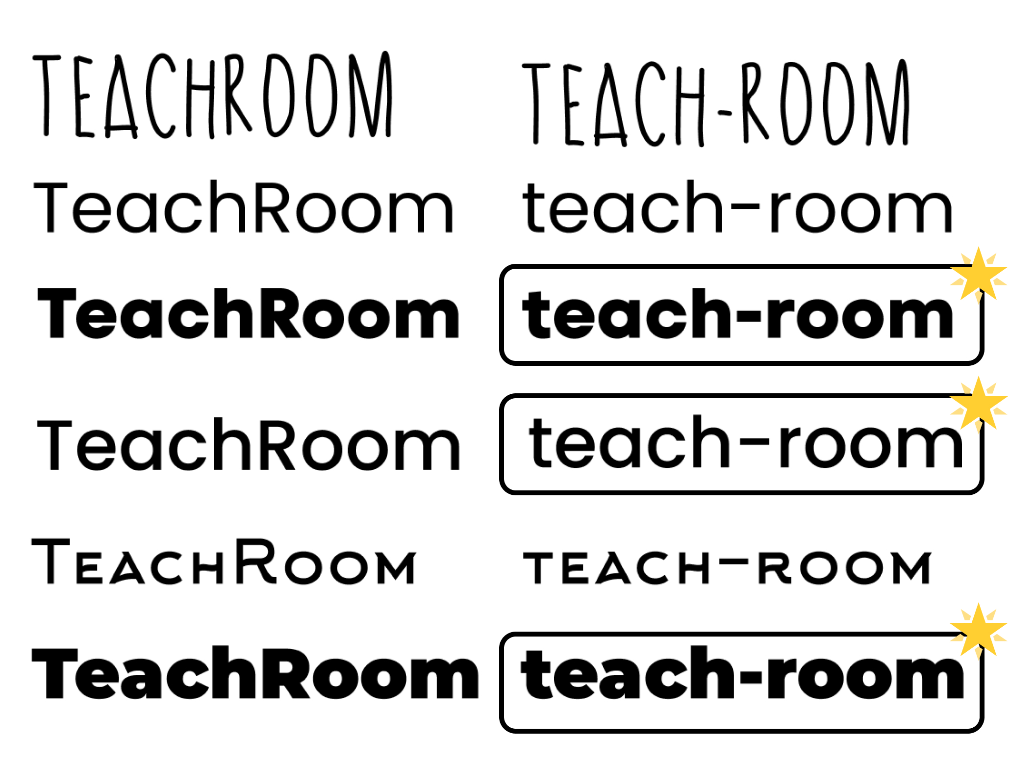
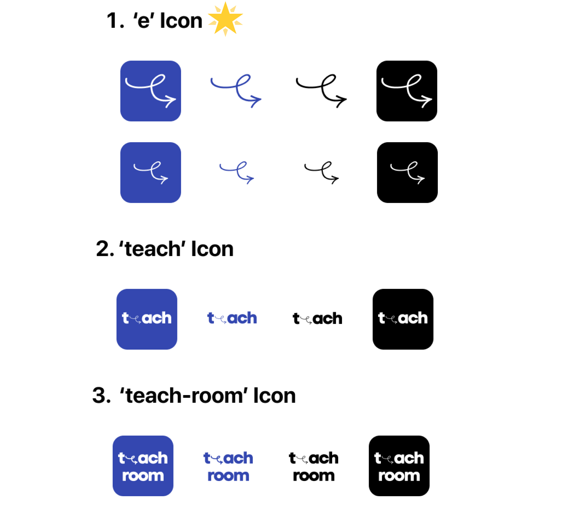
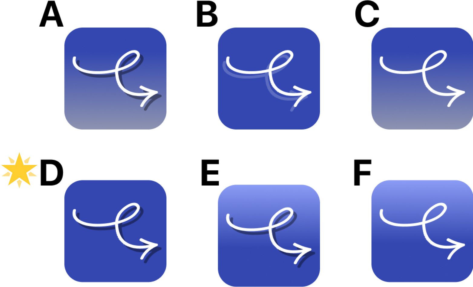
Then after further exploration I came to the chosen wordmark and app icon:
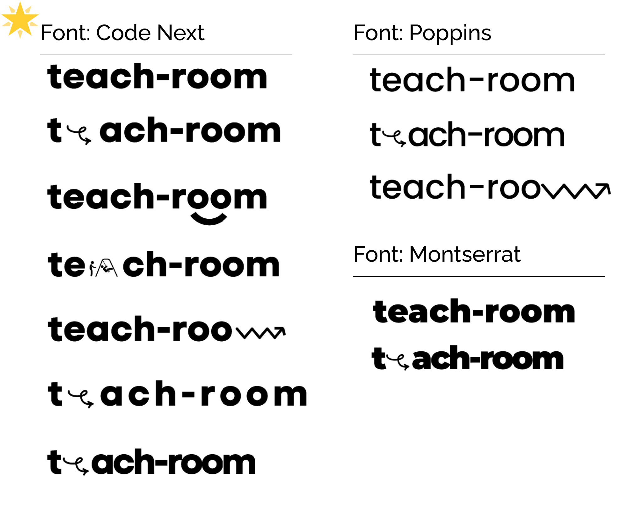
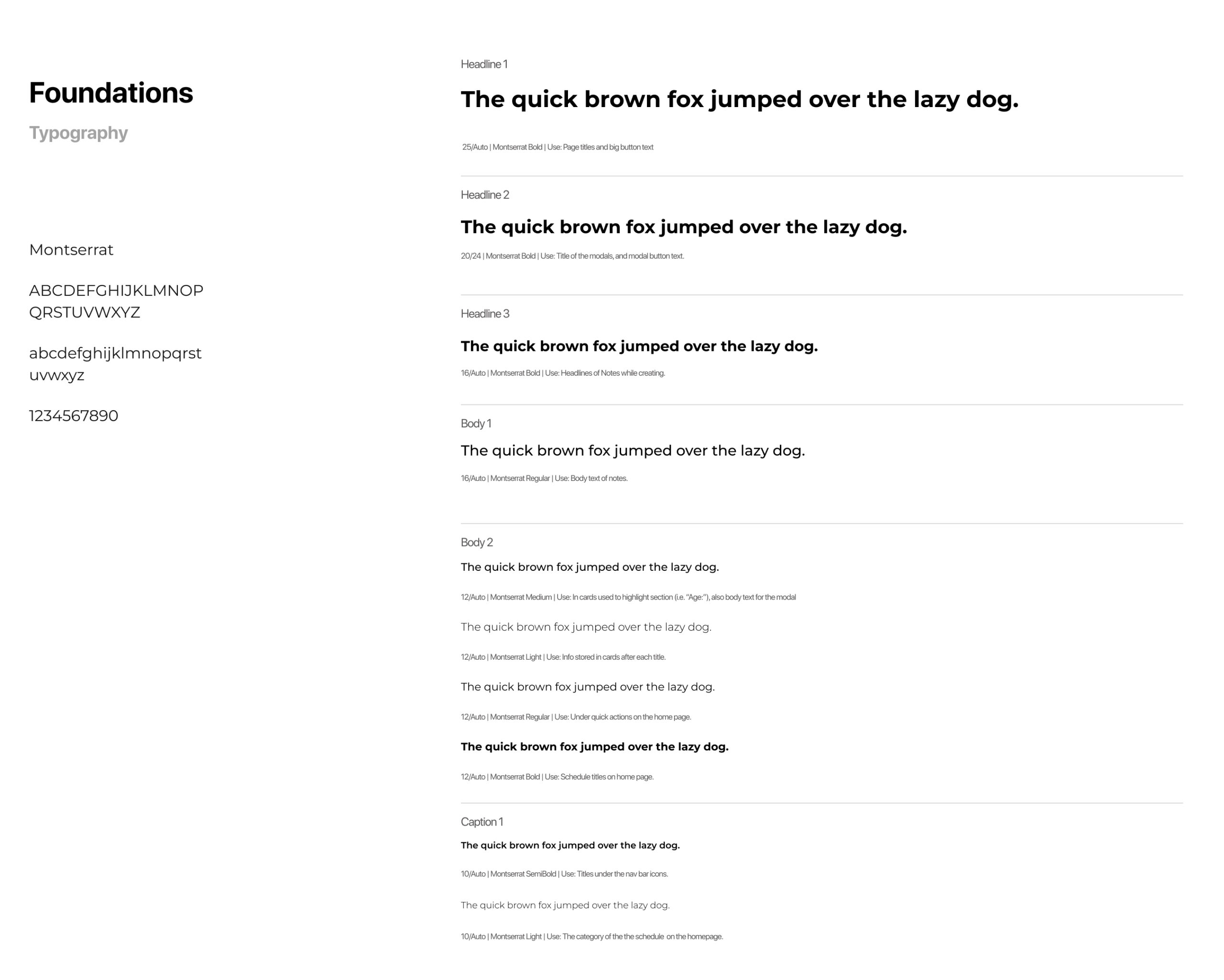
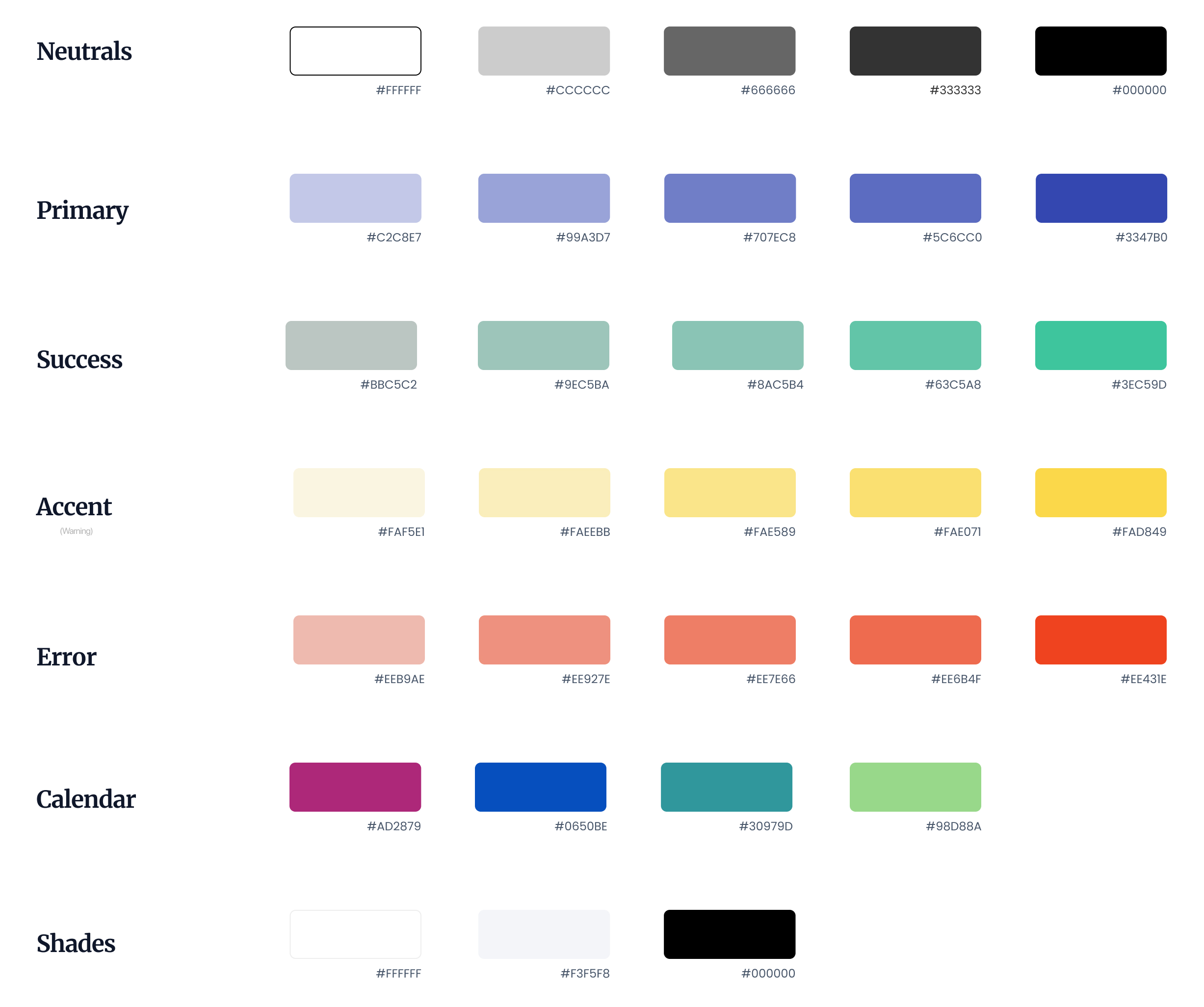
Colors & Typography
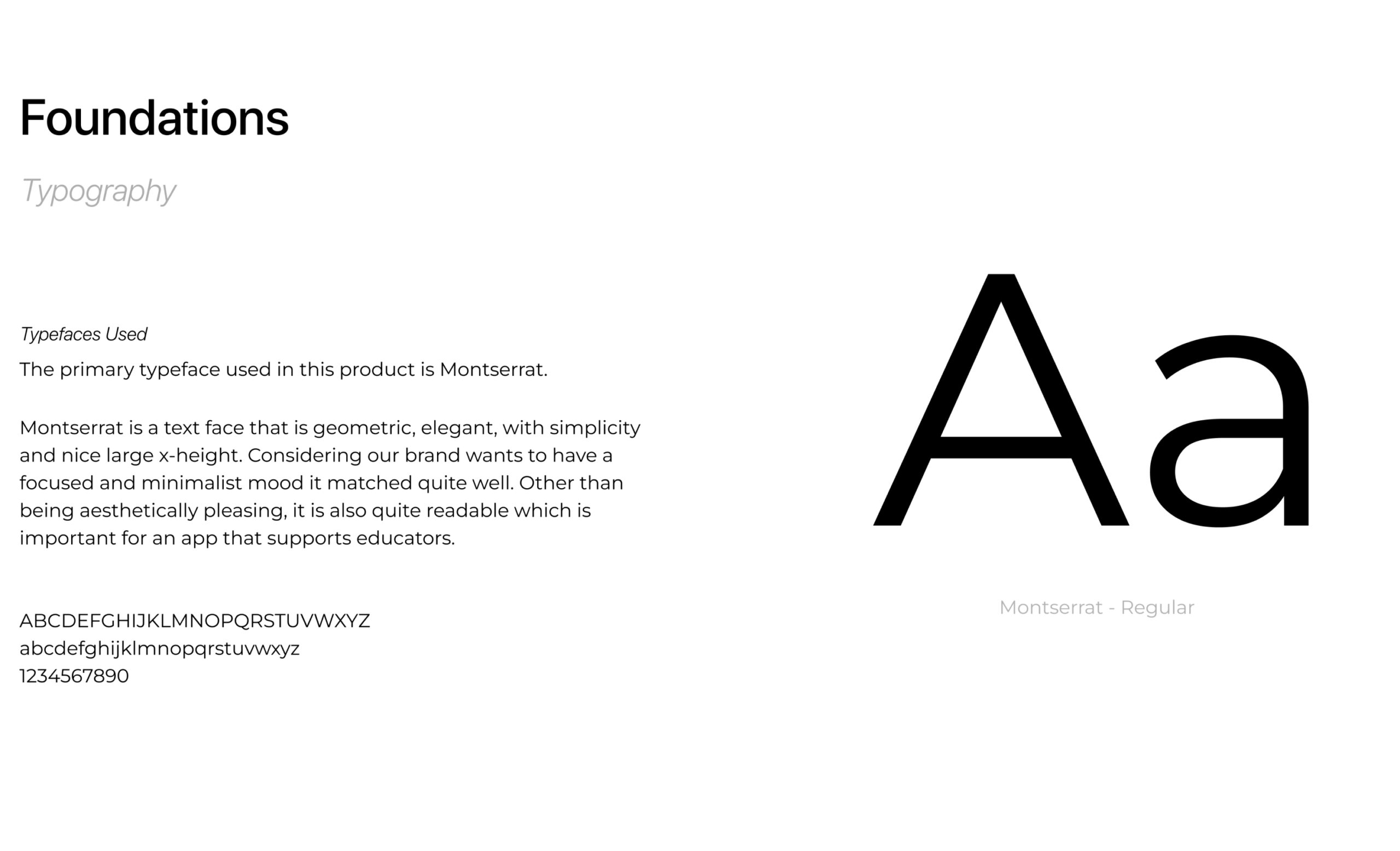
The app was designed to be simple, minamilistic but focused. Therefore, it is imperative that the colors of the UI and typography can help achieve that mood.
Color Injection
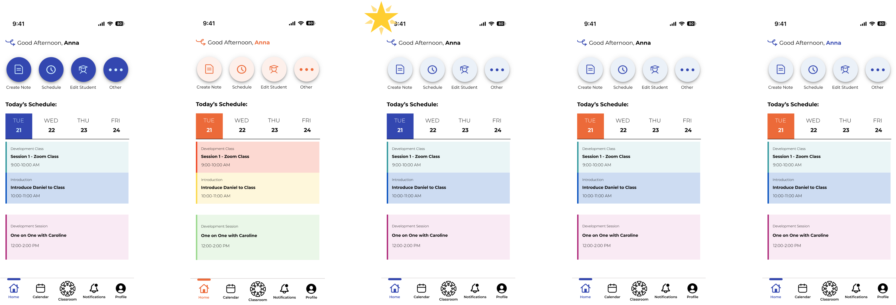
After the colors had been selected I tried injecting the colors in different ways to see which color combinations work best with the application layout:
Final Prototype & Next Steps
Here is the final prototype you can play around with. Try adding a new note for Daniel Kafka and sharing the notes with his parents:
Marketing Campaign
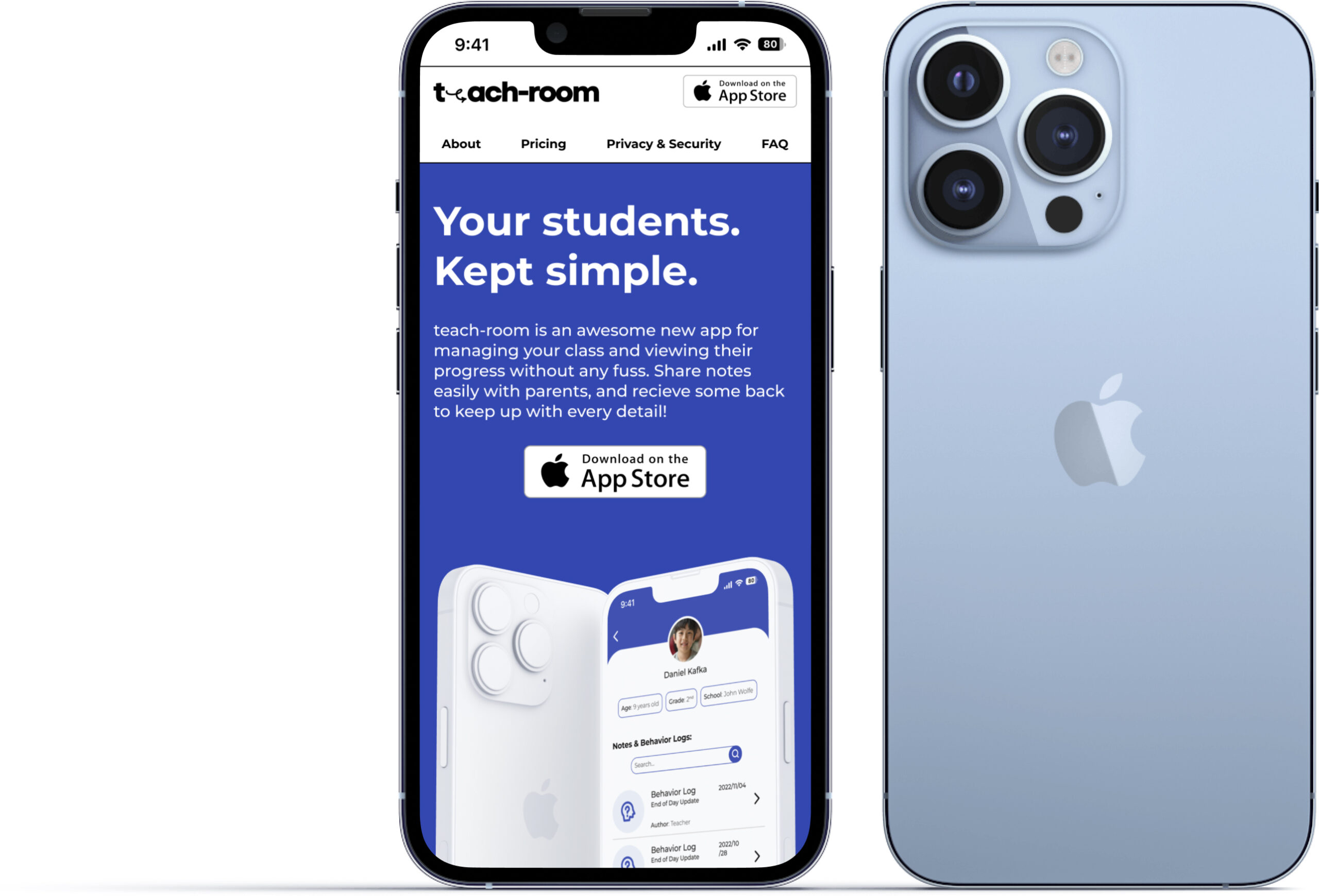
To better expand the project and get the full process I created a marketing website, both on web and mobile. This also helped me practice responsive design.
Alternate Platform
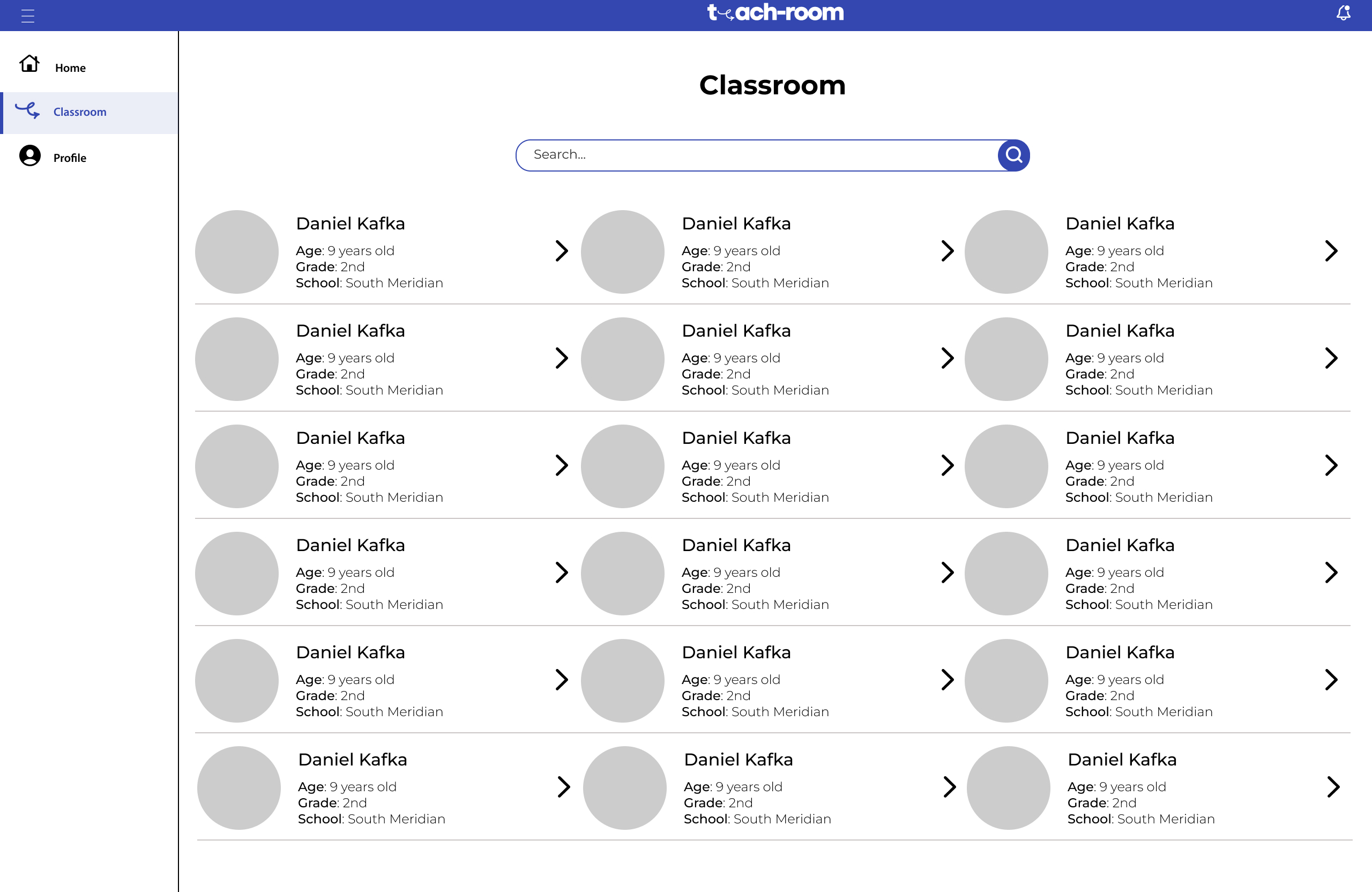
One of the most important things to consider when creating an app is the needs of the users. One consideration to think about is that our persona, an educator, might want to have teach-room on a web application as a educators often have computers on hand while working. I explored this idea very briefly with this mid-fi wireframe.
Next Steps & Key Learnings
Next Steps
Creating a more detailed note taking section that includes photos.
Showcasing how the parent side of the application would look like.
Having a web and android version to expand the brand to different forms.
Key Learnings
When creating early wireframes, using a grid and soft grid helps later on.
Adding color and branding to the application takes a lot of time.
Doing A/B research would be useful at this stage.
Branding has to be accessible to all forms incase the brand expands.

